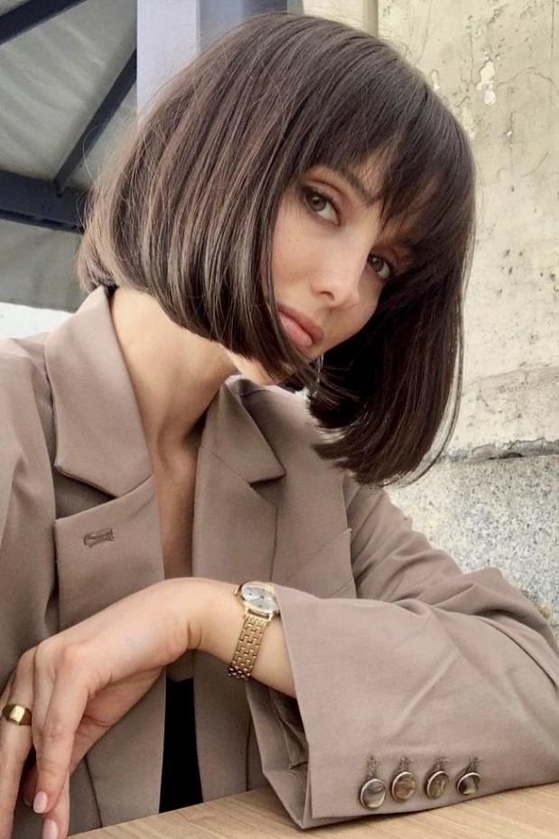
Seasonal color analysis is a styling method designed to help you discover which colors harmonize with your natural coloring—your skin tone, hair color, and eye color—to enhance your overall appearance. Instead of randomly picking shades that might look good, this approach gives you a personalized palette rooted in principles of color theory and contrast.
Let’s dive into what seasonal color analysis is, how it works, why it’s useful, and how you can use it in your wardrobe, makeup, and beyond.
What Is Seasonal Color Analysis?
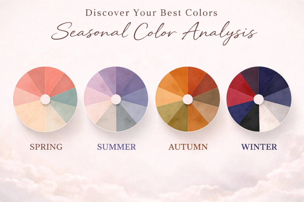
Seasonal color analysis is a system that classifies people into specific color families—traditionally called Spring, Summer, Autumn, and Winter—based on the tones in their natural coloring. Each season corresponds to a particular set of colors that look especially flattering on people who share that season’s characteristics.
The idea is simple: just as nature’s colors change with each season, so do the colors that best complement different combinations of skin, hair, and eyes. In practice, if your natural undertones and contrast levels align with a seasonal palette, wearing those shades can make you look more vibrant, youthful, and balanced.
Why “Seasons” and What They Mean
The season labels are metaphors drawn from the way colors appear in nature during different times of the year:
- Spring evokes fresh flowers and sunny days.
- Summer reflects soft, cool twilight hues.
- Autumn suggests warm, earthy tones.
- Winter embodies crisp, bold contrasts like snow against dark evergreens.
Although the names are symbolic, the method itself is grounded in measurable color attributes: undertone (warm vs cool), value (light vs dark), and chroma (bright vs muted) of your natural coloring.
The Core Dimensions of Your Color Profile
Before talking about the seasons themselves, it helps to understand three key color concepts:
💛 Undertone
This describes the subtle hue beneath your skin’s surface. It’s usually categorized as:
- Warm (golden, peachy, or yellowish),
- Cool (pink or blueish), or
- Neutral (a balanced mix of warm and cool).
Undertone sets the basic temperature of your color palette.
🔆 Value
Value refers to how light or dark your coloring is. People with lighter hair and skin typically fall into lighter palettes, whereas those with dark hair and deep skin tones gravitate toward darker palettes.
🌈 Chroma (Saturation)
This measures how intense or muted a color appears. Bright, clear hues have high chroma, while soft, subdued shades have low chroma. This is especially important in the more nuanced versions of seasonal color systems.
Understanding these three components helps you identify which colors will harmonize with your natural features instead of washing you out or clashing.
🌸 Spring — Warm, Light, and Clear
Who fits this season?
Typically people with warm undertones and lighter, bright coloring—think golden blonde or light auburn hair, warm peach or ivory skin, and light eyes.
Color characteristics:
This palette favors warm, bright shades that feel fresh and uplifting, such as coral, peach, soft aqua, and warm greens. These tones reflect the heart of spring’s vibrancy and warmth.
Spring palettes often bring out warmth in the skin and complement light, warm hair and eyes beautifully.

Best colors:
- Coral, peach, apricot
- Warm pinks
- Light turquoise, aqua
- Mint, light warm green
- Golden yellow
- Warm ivory, cream
- Camel, light tan
Avoid: black, icy pastels, very dark or dusty colors
☀️ Summer — Cool, Soft, and Muted
Who fits here?
People with cool undertones and an overall lighter, softer contrast—often with ash blonde, light brown, or soft pastel-eye combinations.
Color characteristics:
The Summer palette leans toward cool and muted tones: dusty rose, lavender, powder blue, soft gray, and gentle greens. These colors mirror hazy summer skies and cool ocean breezes.
Because the palette is soft, overly bright or warm shades can overwhelm someone with a Summer profile.

Best colors:
- Dusty rose, soft mauve
- Lavender, lilac
- Powder blue, periwinkle
- Soft navy
- Sage, blue-based greens
- Cool gray
- Soft white
Avoid: neon colors, orange, warm browns
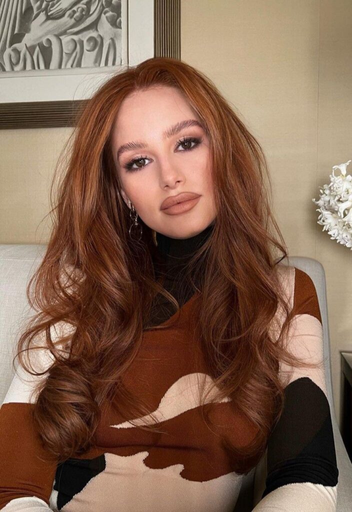
🍂 Autumn — Warm, Rich, and Earthy
Who fits this season?
Warm undertones with deeper, richer coloring—common for red, auburn, or dark brown hair and golden or olive skin.
Color characteristics:
Autumn colors are inspired by fall landscapes: rust, mustard, olive green, camel, terracotta, and deep teal. These earthy, warm tones underscore the warmth in both hair and skin.
Autumn palettes often include muted, warm shades that enrich natural depth and glow.
Best colors:
- Rust, burnt orange
- Mustard, golden yellow
- Olive, moss green
- Teal (warm-leaning)
- Terracotta, cinnamon
- Chocolate brown
- Warm beige, camel
Avoid: icy pastels, cool grays, stark white
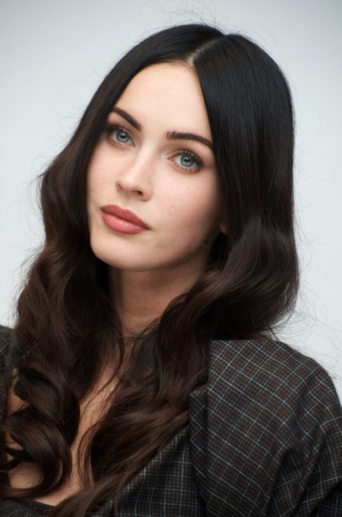
❄️ Winter — Cool, Bold, and High-Contrast
Who fits here?
People with cool undertones and strong contrast in their features—such as dark hair with light skin or striking eyes.
Color characteristics:
Winter palettes contain cool, vivid hues like icy pastels, jewel tones, black, pure white, and bold saturated shades. These colors reflect the dramatic clarity of a winter landscape.
Winter colors are intense and crisp, making them great for individuals with strong natural contrasts.
Best colors:
- Black and true white
- Emerald, pine green
- Royal blue, cobalt
- True red, cherry
- Fuchsia, magenta
- Icy pink, icy blue
- Charcoal
Avoid: dusty tones, warm beige, muted earth colors
Benefits of Knowing Your Season
Seasonal color analysis offers benefits far beyond simply knowing what colours look good on you:
✅ Boosted Confidence
Wearing colors that match your natural tones makes your skin glow, reduces the look of shadows or tiredness, and enhances eye color—making you feel more confident and put-together.
✅ Smarter Shopping
Once you know your palette, you spend less time trying on endless shades that don’t work. You’ll focus only on pieces that complement you, saving time and money.
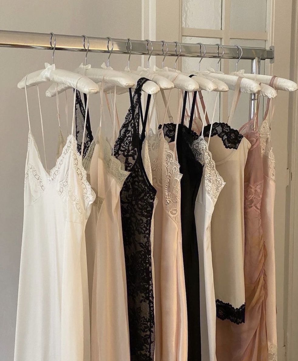
✅ Cohesive Wardrobe and Makeup
A consistent seasonal palette ensures everything in your closet works together. It also helps when selecting makeup, accessories, or even hair color choices.
✅ Reduction of Waste
When you choose intentional colors that flatter you, it lessens impulse buys that end up unworn. This aligns with more sustainable fashion habits.
Beyond the Theory: Practical Tips for Applying Seasonal Color Analysis
Here’s how you can make this work in your everyday style:
👕 1. Start With Natural Light
Always determine colors in daylight without harsh fluorescent light for the most accurate impression.
🪞 2. Test Close to Your Face
Use fabric swatches or clothing near your face. Colors that brighten your skin and make eyes pop are usually good matches.
💄 3. Consider Makeup and Accessories
Foundational palettes also translate to lipstick, blush, and even jewelry tones (silver vs gold). Experiment to see which feel cohesive.
🧠 4. Trust How You Feel
If a shade makes you feel confident and radiant—even if it’s slightly outside your “season”—trust your reaction. The rules guide you, but personal preference matters too.
🔄 5. Be Open to Refinement
Many people find their season evolves as they try subtler palettes or refine their analysis with professionals or apps.
Final Thought
Seasonal color analysis is less about rules and more about clarity. When you understand which colors naturally support your features, getting dressed becomes simpler and more intentional. The right colors don’t change you—they highlight what’s already there, making your style feel effortless and aligned!